Where design elegance meets skincare tradition.

Navigating the skincare world can feel like learning a new language – AHA/BHA, Retinol, Hyaluronic Acid – it's a whole new realm! But just like in those classic makeover movies, we knew the brand (and our skincare knowledge) needed a glow-up.
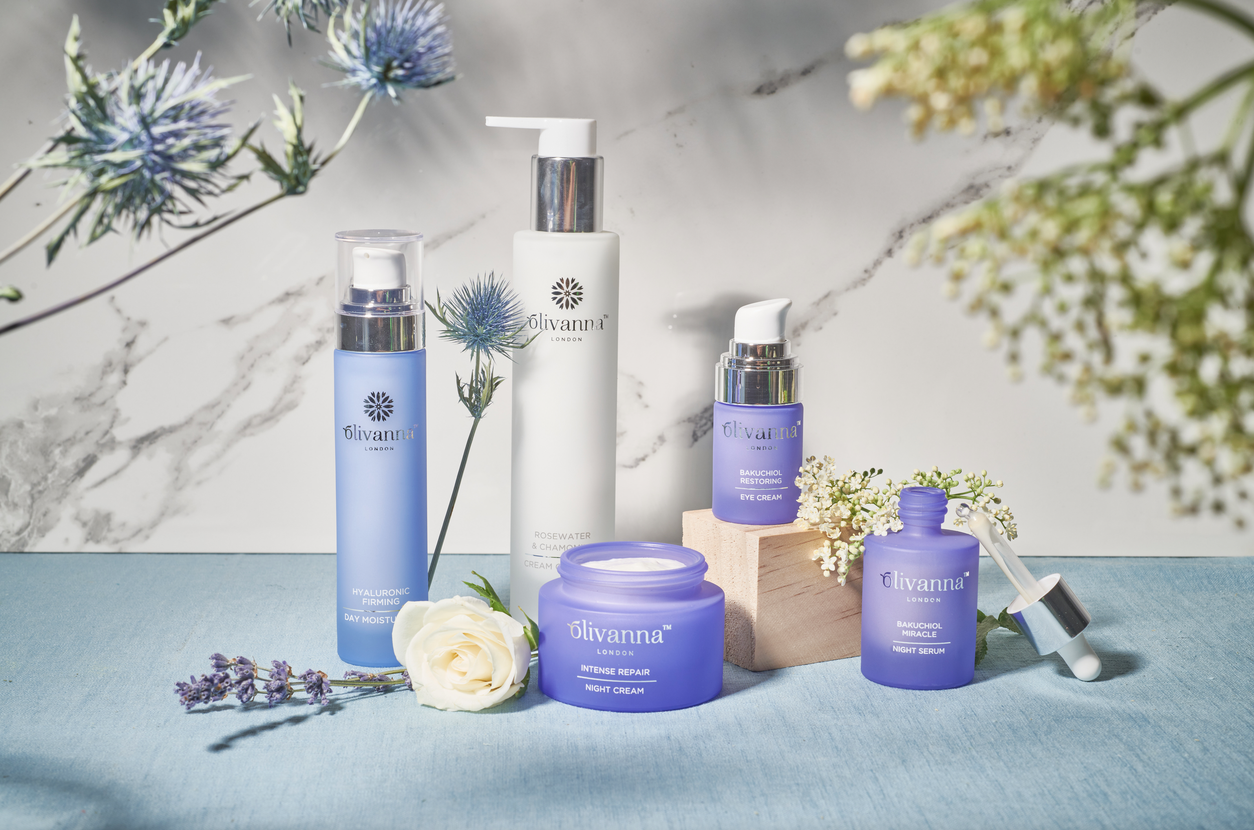
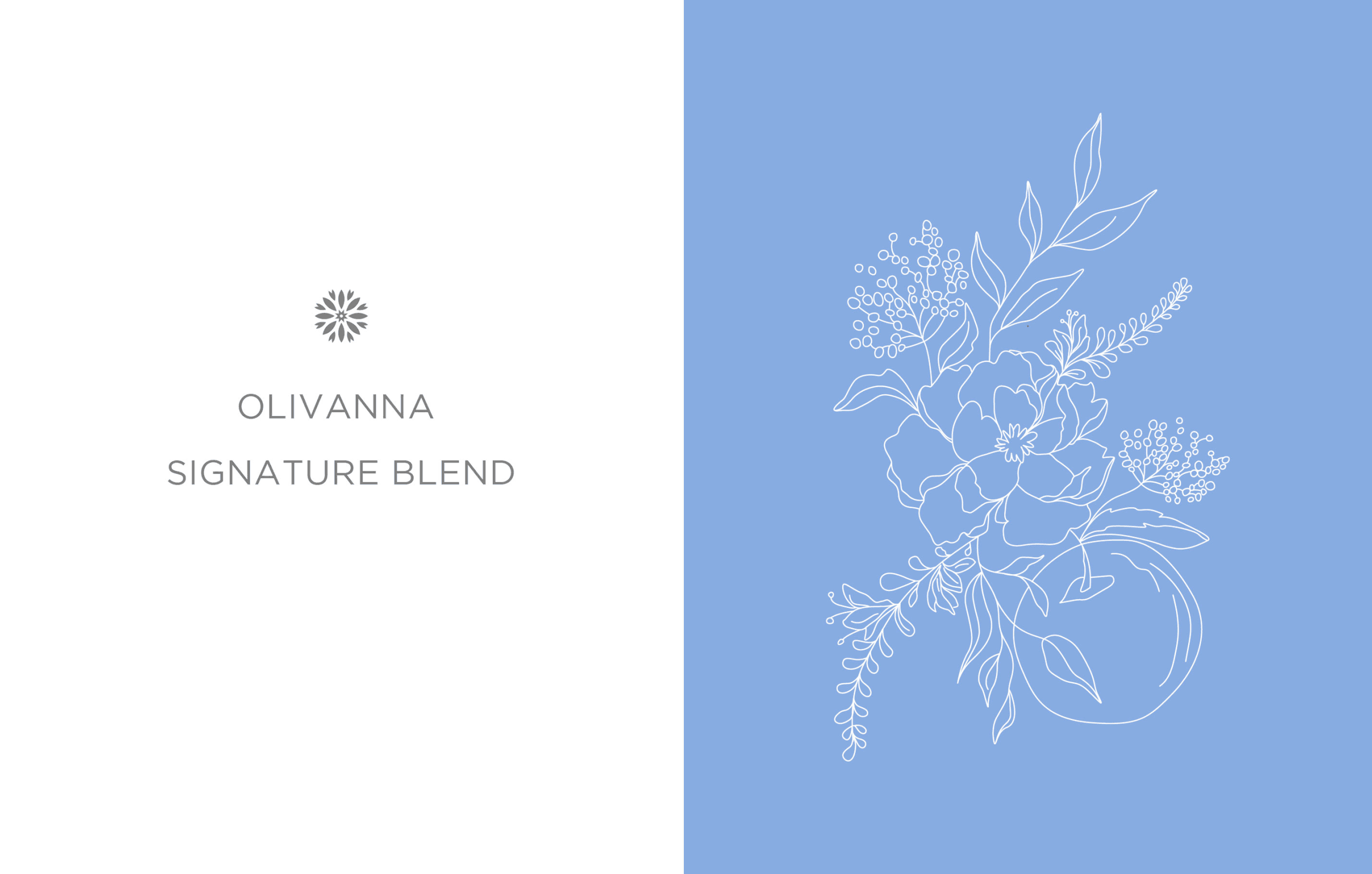
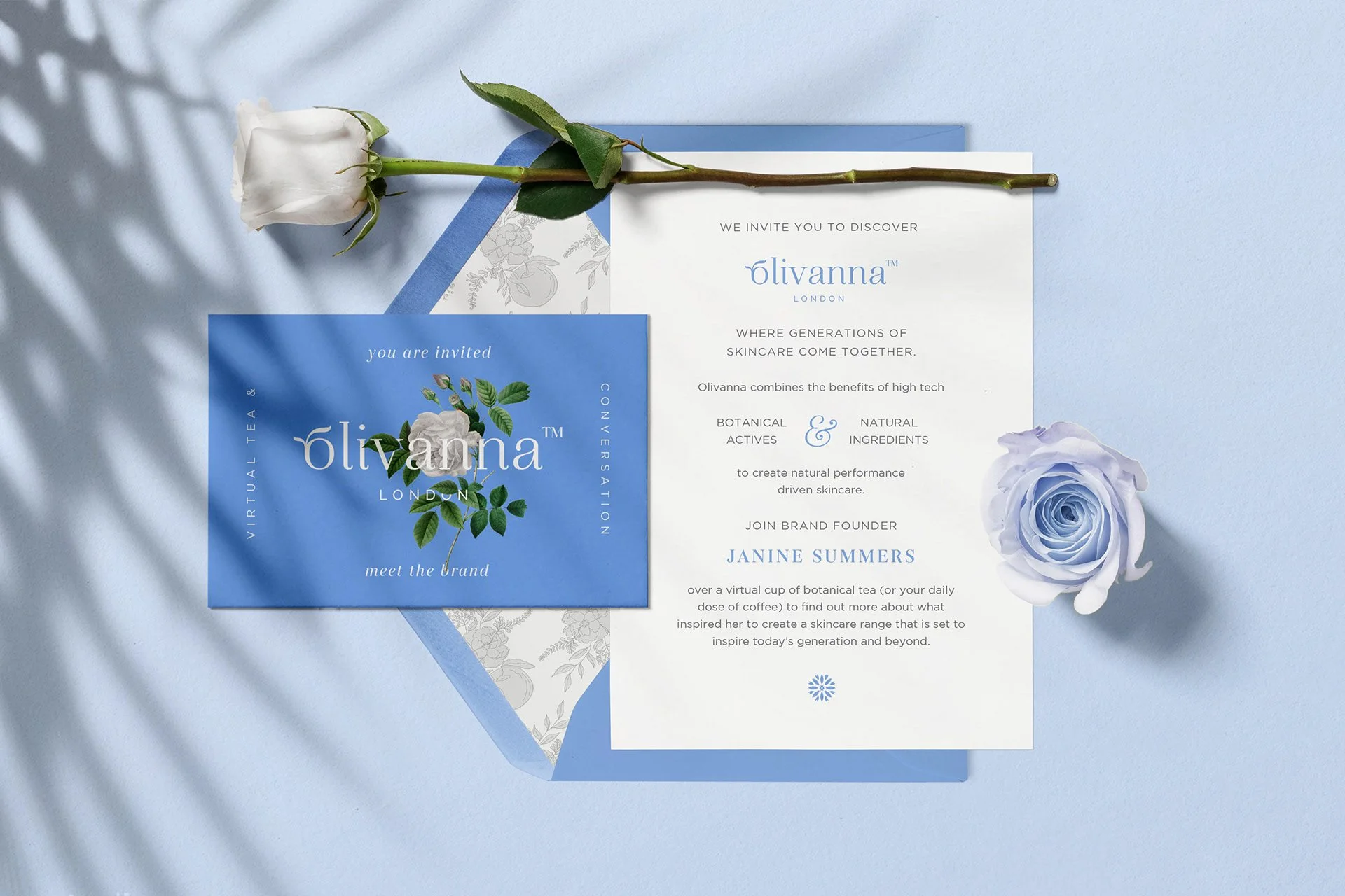
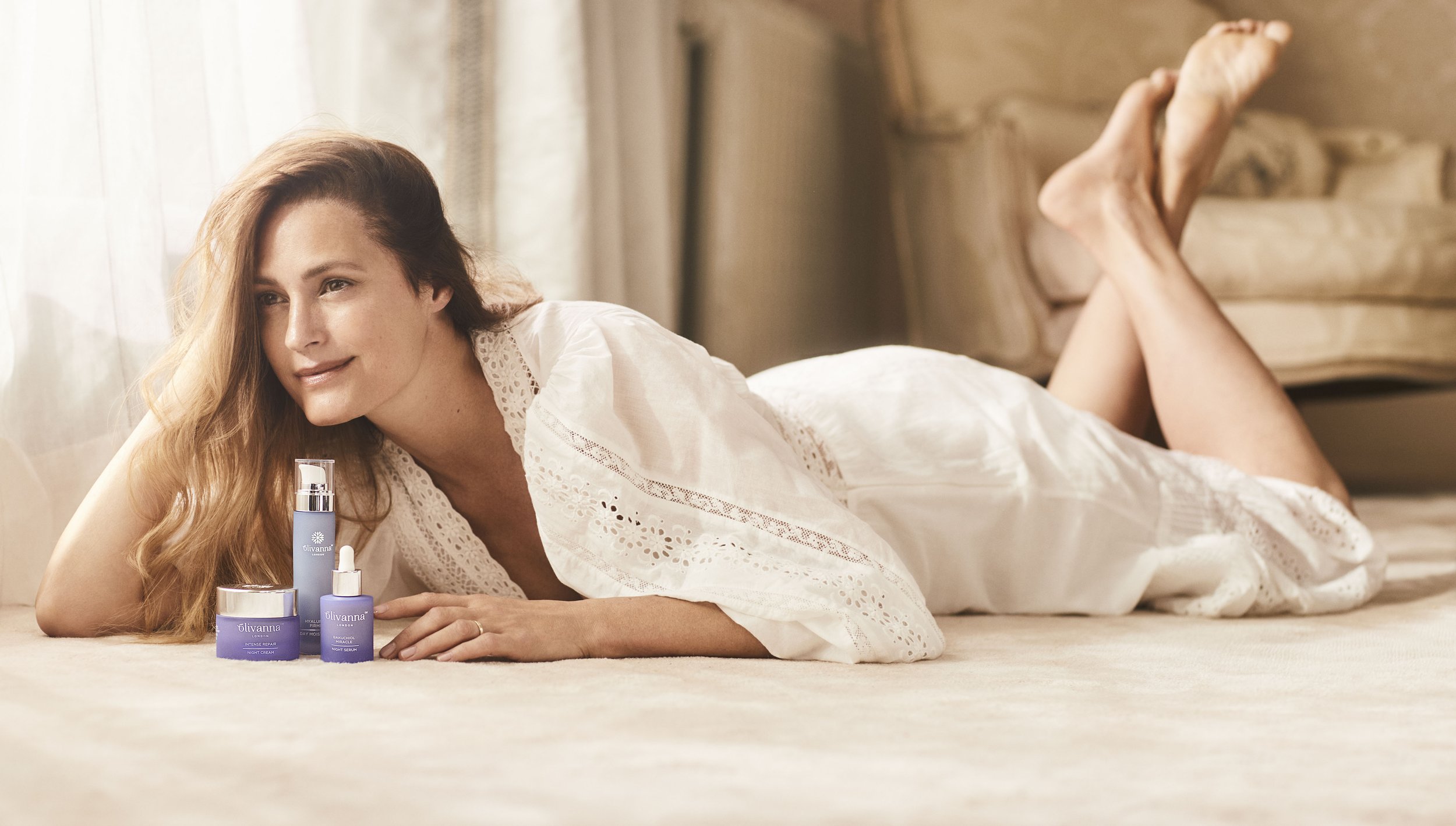
Introducing Olivanna London, a skincare startup nestled in the heart of London, curating products steeped in generational wisdom.
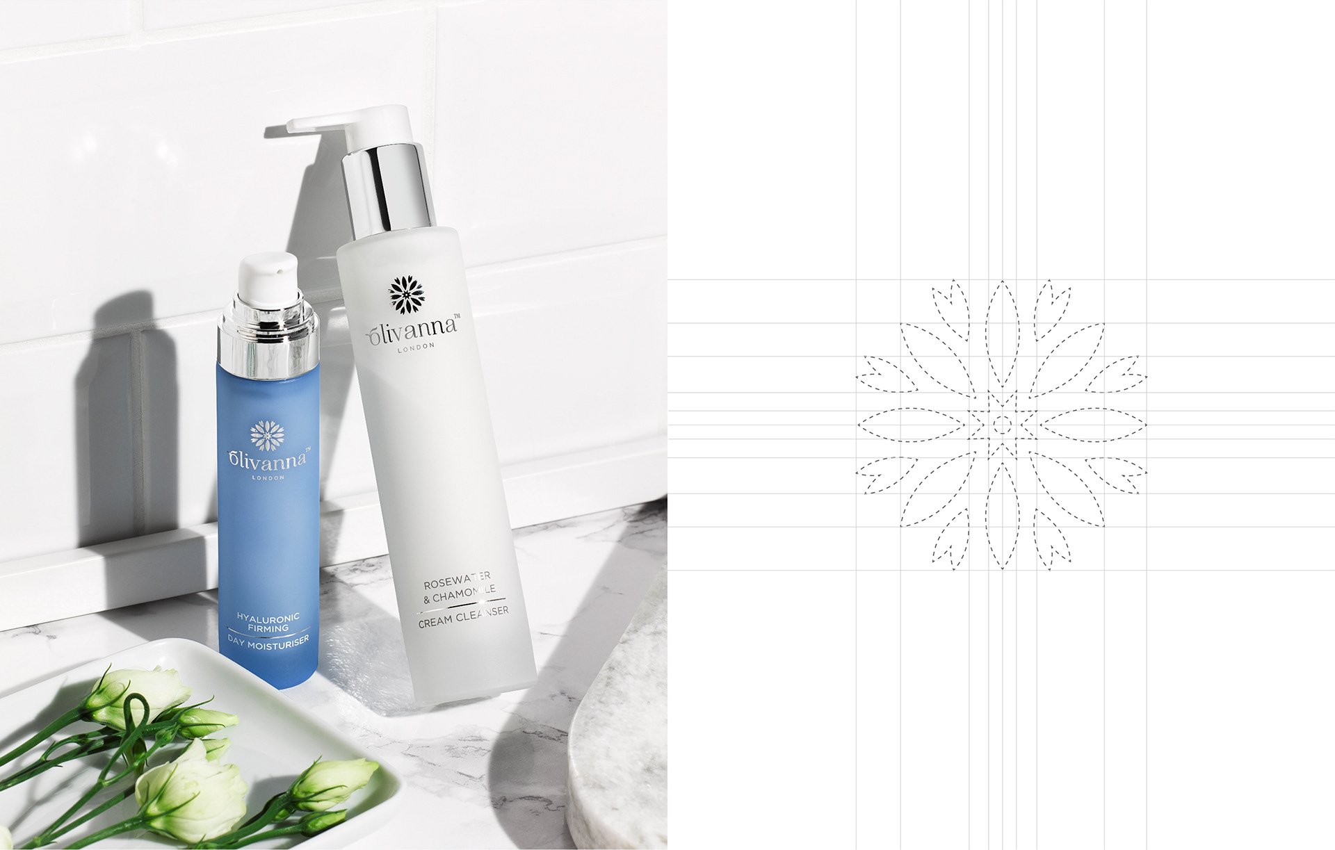
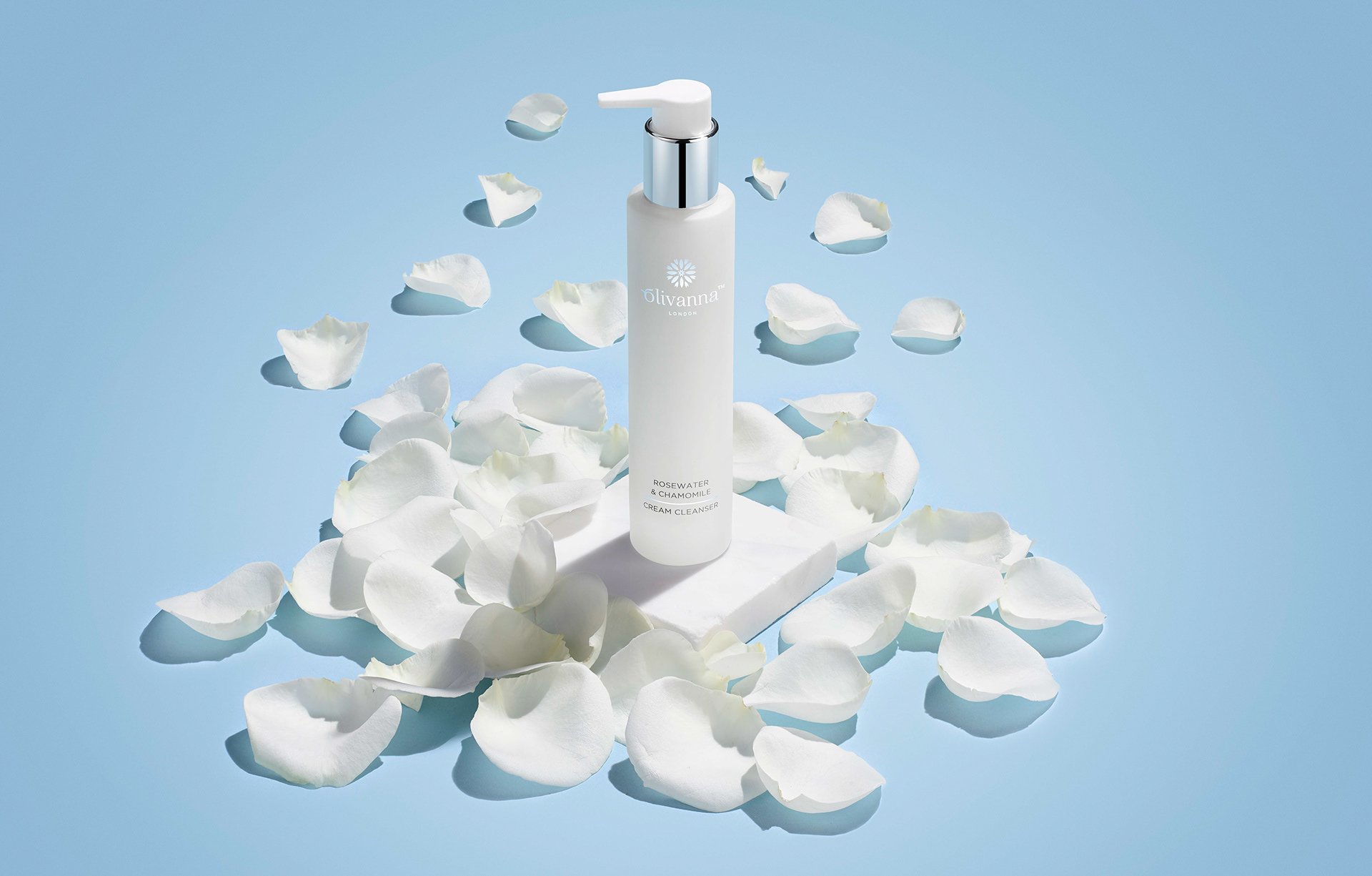
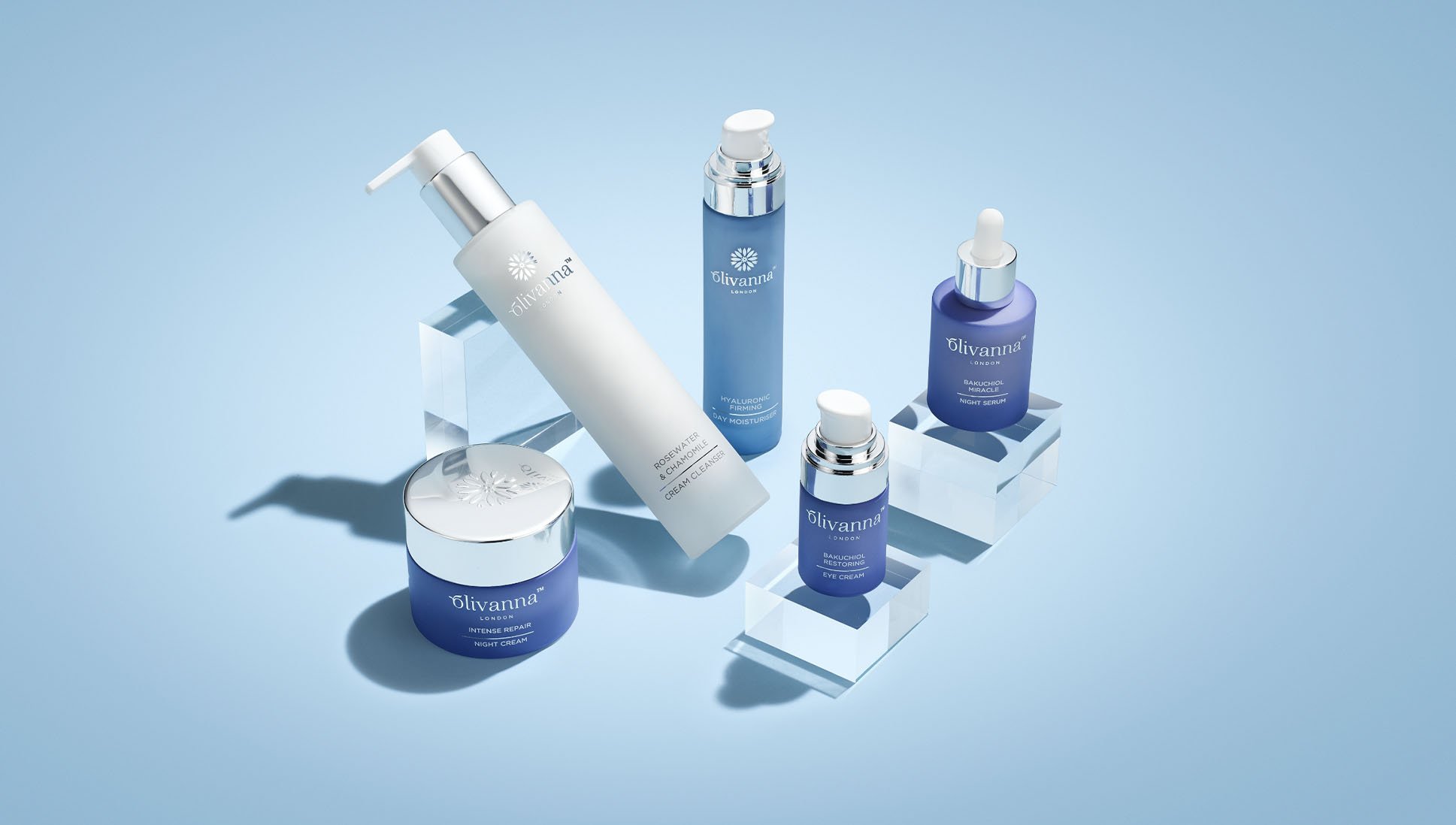
Beginning with a fresh art board, we immersed ourselves in the ideology of this natural luxury brand. Delicate typography, featuring two leaves symbolizing the bond between mother and daughter, added a personal touch.
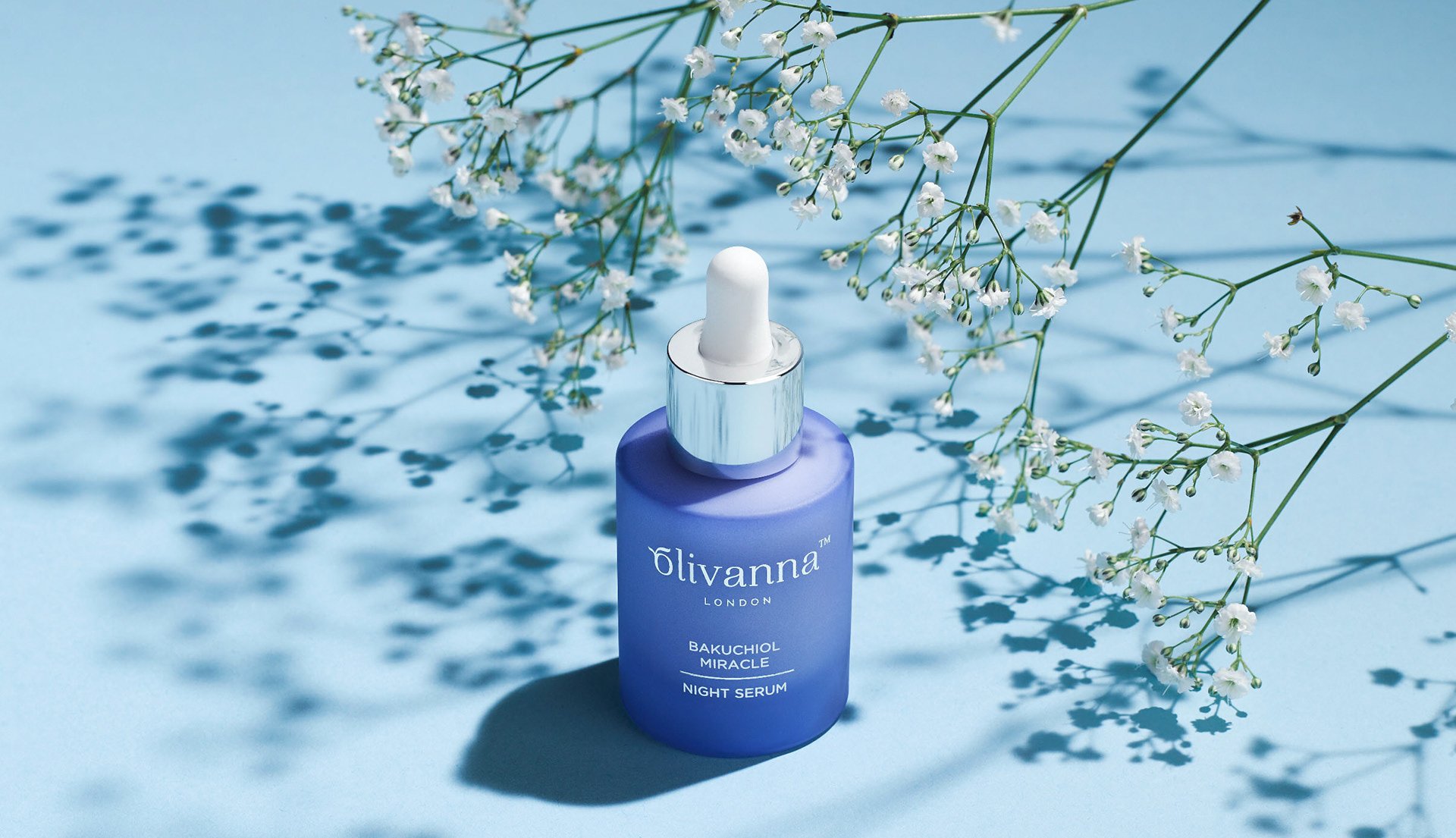
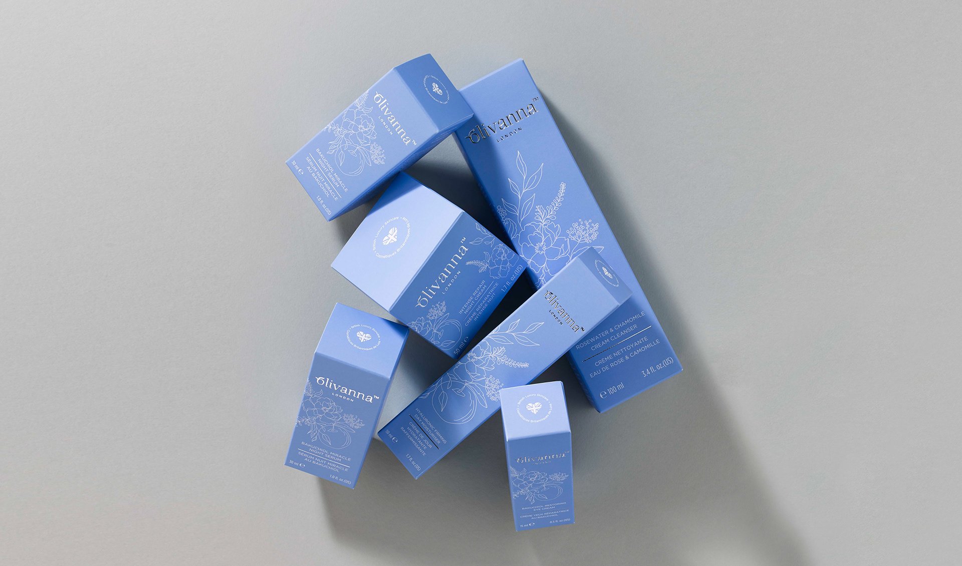
Inspired by the British cornflower, our color palette brought soothing yet brightening vibes to Olivanna's packaging design. Gentle blue hues cleverly differentiated between day and night products. And to top it off, a cornflower icon added that final mist of branding magic.
With a custom pattern adorning brand ingredients from their signature scent, the branding emerged as plump, classy, and oh-so-luxurious.