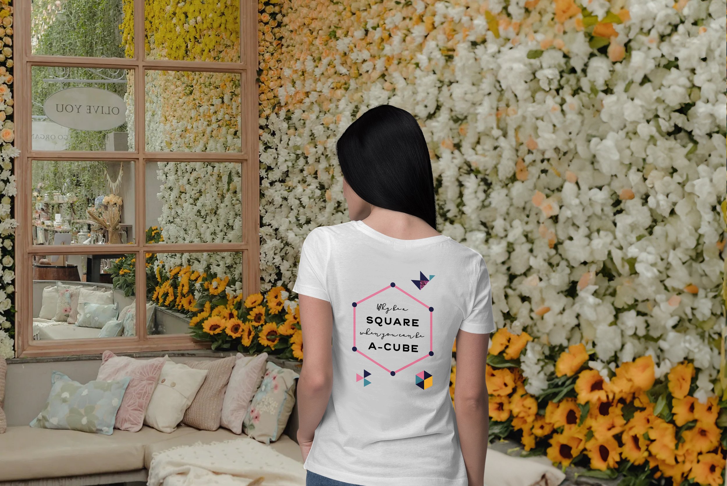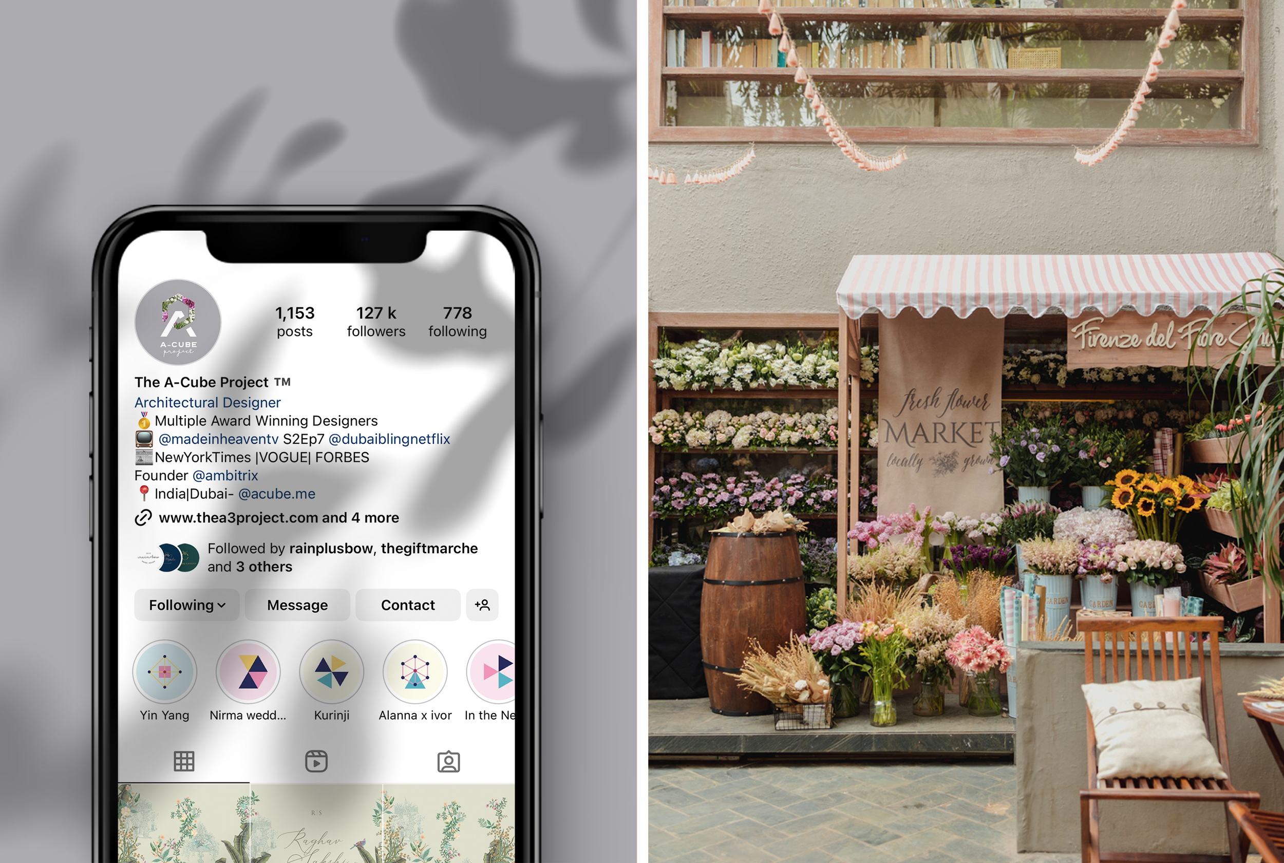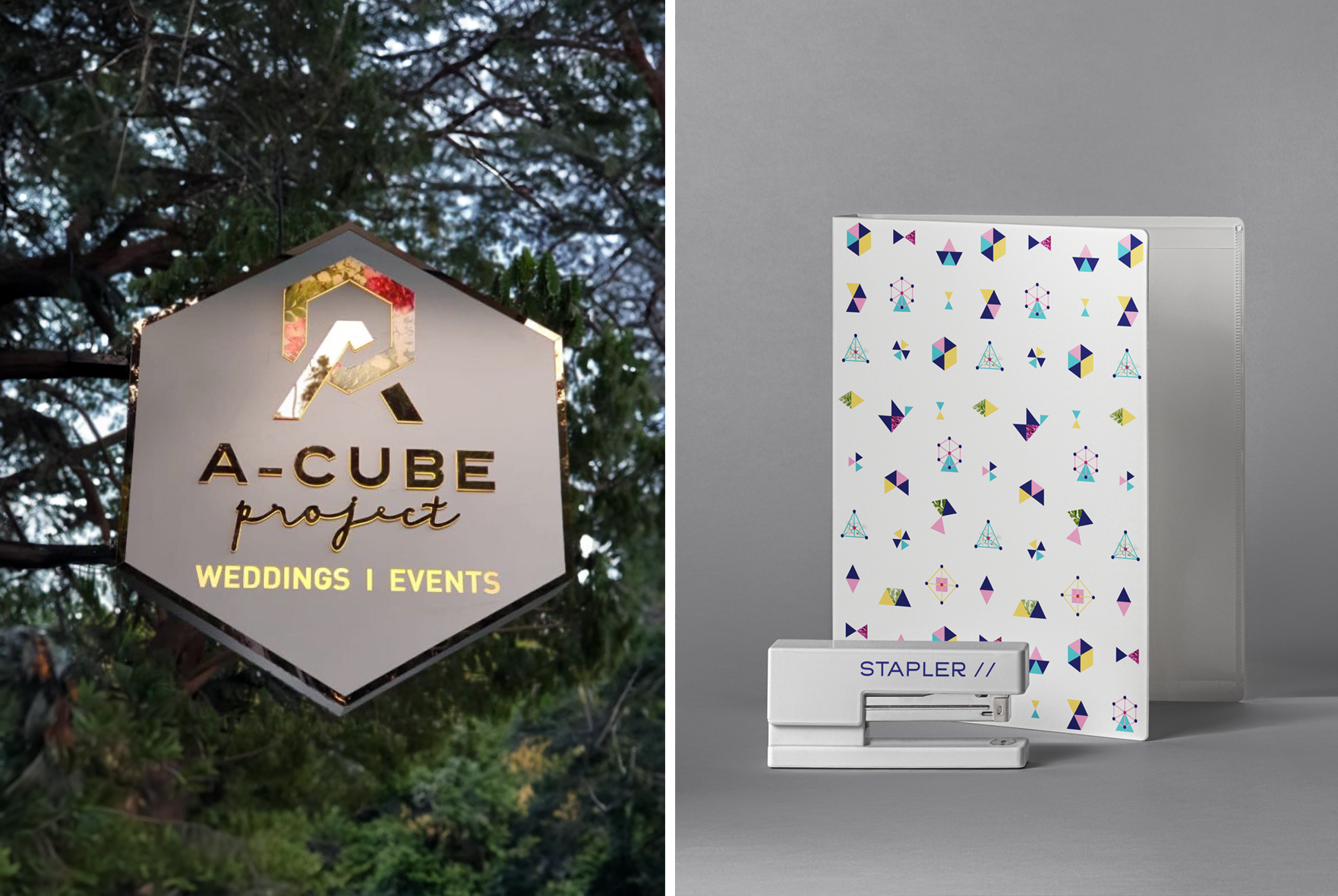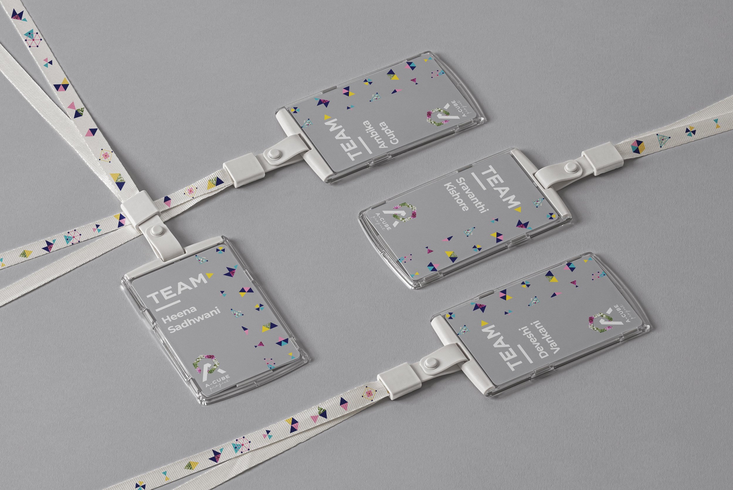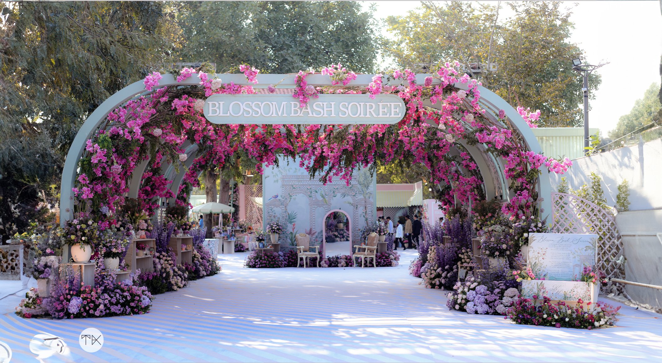
Why be a square, when you can be A-Cube.
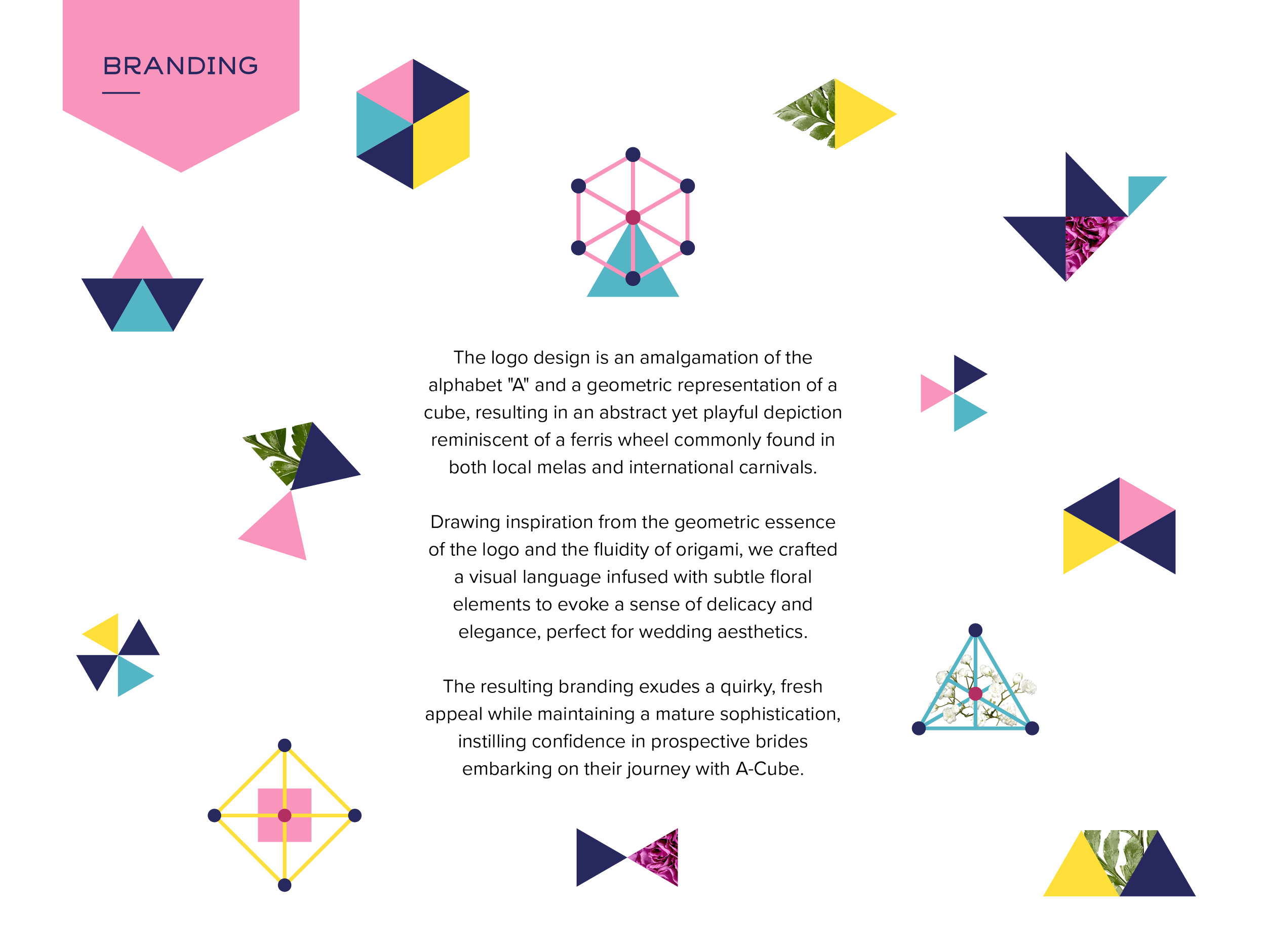
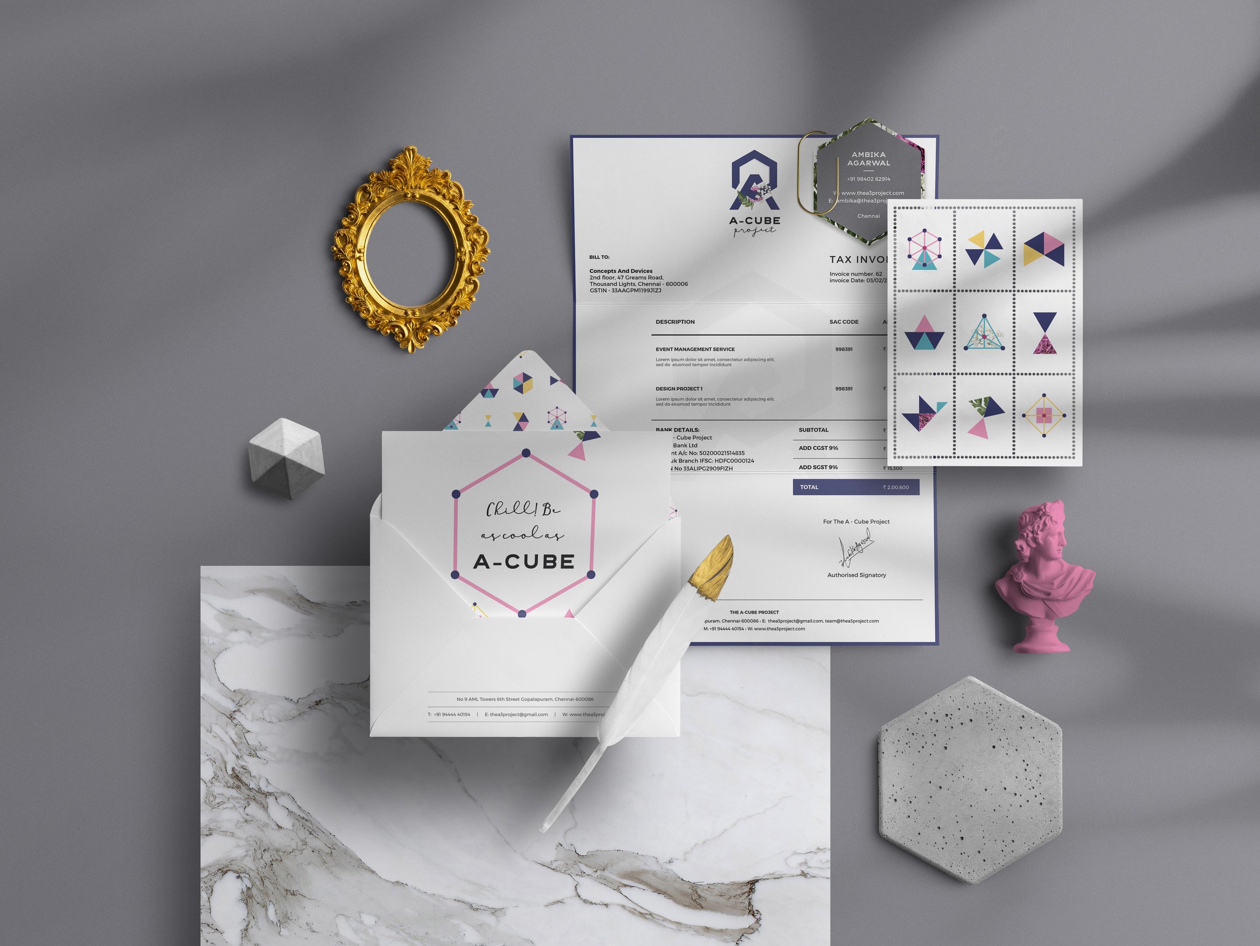
When the powerhouse founder of The A-Cube Project approached us, she made one thing crystal clear: she was tired of the same old pretty pastel, Pinterest-inspired branding that saturates the wedding industry. She craved quirk, character, and a dash of her own unique design flair for her brand. Ditching the tired stereotypical motifs, we crafted a brand language that blended geometry, origami, and just a hint of flora. The end result? Branding that screams individuality and poses the age-old question: why blend in when you were born to stand out?